Lab 05: What makes an estimate the best one?

An introduction to ggplot2

ImportantDue date

This lab is due today, by the end of class. Commit and push your lab-05.qmd and rendered PDF to your own lab repo, and submit that PDF on Gradescope.

Introduction

Everyone before Gauss worked forwards: assume the errors look like this, therefore the best estimate is that. In 1809 Gauss ran the argument backwards. He assumed the answer — everybody already averages their measurements, so take it as given that the average is the most probable value — and asked what the error curve would have to look like for that to be true.

Out came the normal curve. And because the normal curve makes least squares the right thing to do, Gauss had justified least squares.

Today you will build, from scratch, a thing that decides. Given five measurements and a candidate for the truth, you will write code that scores how badly that candidate fits — and then score every candidate and take the winner.

Do it one way and the winner is the mean. Change a single line and the winner is the median. Change another and it is the midrange. Three defensible rules, three different answers, one set of numbers. That is the argument Legendre, Gauss and Laplace were having, and you will have finished it by the middle of class.

Learning goals

By the end of this lab you will be able to:

  • tell random error from systematic error, and say which one averaging fixes;
  • build a plot one layer at a time with ggplot(), aes(), and a geom_, and look the rest up on a cheatsheet;
  • write your own function, and call it from a loop;
  • explain why errors must lose their signs before they can be added;
  • score every candidate on a grid and find the best one with which.min();
  • show that minimizing squared errors gives the mean, absolute errors the median, and the worst error the midrange;
  • read an estimate against its own uncertainty, and say when an effect is too small for the data to see.

Opening activity — how wrong is a room full of people?

Laptops closed. Everyone needs a scrap of paper.

Round 1 — one guess, on your own

Write down your best guess at Kat’s age. One number. No conferring, no ranges. Write it down on the small piece of paper.

That number is a measurement. You are the instrument, her age is the quantity being measured, and your guess might be wrong by some amount.

Round 2 — put the whole class on one chart

Your instructor has written a column of ages down the side of the board, one per row, and each group has a different colored marker.

Go up and draw one tally mark, in your group’s color, on the row for your guess.

Now, in your group, compute two summaries of your four guesses by hand:

Summary How to get it
Mean add the four, divide by four
Median the average of the middle two, in order

Then send someone up to write your group’s letter, in your color, in the “group means” column to the right of the tallies, on the row closest to your group’s mean.

Round 3 — read the chart

With your group:

  1. Find your own color. How many rows do your group’s four marks spread across? Now find your group’s letter. Is it inside that span, or outside it?

  2. Now look at the four letters together. How many rows do they spread across, compared with the tally marks? Is any letter out at the top or bottom rows where the most extreme marks are?

  3. Suppose you had to bet. Would you rather bet on one tally mark picked at random, or on one group letter picked at random? Say why, using the chart rather than any formula.

  4. Did your group’s mean and median come out the same, or different? If they differ, which of your four guesses is responsible, and which of the two summaries moved?

NoteWhat the chart does and does not show

The tally marks reach across more rows than the letters partly for a boring reason: there are sixteen marks and only four letters, and more numbers reach further simply by being more numerous.

Read the positions instead. The letters cluster toward the middle, and none of them is out at the ends where the more extreme marks are. That is the real effect and it is not an artifact of counting: an average of four people is much harder to drag to an extreme than any one person is.

Round 4 — one bit of information

Your instructor is not going to tell you the answer. She will tell you one thing only: whether the class overestimated or underestimated.

  1. Before she says it — look at your chart and try to work it out. Can you? Is there anything in those sixteen numbers that points one way rather than the other?

  2. Now she says it. Did anything on the board predict that? You have a picture of how much the room disagrees with itself. Does it tell you how wrong the room is?

  3. Knowing the direction, can you now correct your group’s estimate? What would you still need in order to do it?

  4. If nearly everyone leaned the same way, is that the kind of error that averaging more people would fix? Would sixteen more students have helped?

TipTwo kinds of wrong

Your four guesses scattered around your group’s own center, and the four group letters scattered less. That is random error, and averaging is exactly the right tool for it: more guesses, tighter center, and the \(1/\sqrt{n}\) shrinkage you met in lecture.

But if the whole room leans the same way — everybody reads a face as younger than it is, everybody underestimates a long distance — that is systematic error, and averaging does nothing to it whatsoever. Sixteen people making the same mistake is still that mistake, reported with more confidence. A hundred would be worse: the same wrong answer, now with a tighter spread around it to make it look trustworthy.

Now open your laptops — Getting your repo

Find your repo beginning with lab-05 in the statistical-history organization. Clone it in RStudio using File → New Project → Version Control → Git and its SSH address. If you have already cloned it, open that project and Pull.

Open lab-05.qmd, enter your name and group, and render once. You should also see a data/ folder, which you will need in Part 4. Keep these instructions beside your working document.

The question this lab is about

Your group produced two summaries of one set of guesses (mean and median), and they probably do not agree with each other.

Prediction 1. If you had to report a single number, should it be the mean or the median? Vote in your group and record the count.

Prediction 2. In a moment you will write code that scores how badly a guess fits. If we change the rule for what counts as “badly,” will the best guess change — or is the best guess simply the best guess?

Part 1 — Record the board

Record your group’s vote on Prediction 1 and your answer to Prediction 2.

Part 2 — Scoring a guess

Your group voted on whether to report the mean or the median. Now we settle it — not by opinion, but by building something that can decide.

The measurements

library(tidyverse)
Warning: package 'ggplot2' was built under R version 4.5.2
── Attaching core tidyverse packages ──────────────────────── tidyverse 2.0.0 ──
✔ dplyr     1.1.4     ✔ readr     2.1.5
✔ forcats   1.0.0     ✔ stringr   1.5.1
✔ ggplot2   4.0.3     ✔ tibble    3.2.1
✔ lubridate 1.9.4     ✔ tidyr     1.3.1
✔ purrr     1.0.4     
── Conflicts ────────────────────────────────────────── tidyverse_conflicts() ──
✖ dplyr::filter() masks stats::filter()
✖ dplyr::lag()    masks stats::lag()
ℹ Use the conflicted package (<http://conflicted.r-lib.org/>) to force all conflicts to become errors

library(tidyverse) loads dplyr, which you used last week, and also ggplot2, which is today’s tool. You do not need a separate library(ggplot2).

Put the age guesses aside and take a smaller set of numbers, where the disagreement is sharper: five readings of the same quantity, made with the same instrument on the same afternoon.

measurements <- tibble(
  reading = 1:5,
  value = c(9.8, 10.0, 10.2, 13.9, 14.1)
)
measurements

Three agree with each other and two do not, and nobody wrote down which two were the mistake. Your group’s guesses probably had the same shape: a cluster, and one or two people well outside it.

A plot is built from layers

Last week you read a pipeline as a sentence: take this data, then filter it, then count it. A ggplot reads the same way, except the steps join with + instead of |>, and each step adds a layer to a picture rather than changing a table.

Every plot needs three things: the data, an aesthetic mapping saying which column becomes which visual property, and at least one geom saying what marks get drawn. Run these three chunks separately and watch each one arrive.

ggplot(data = measurements)

An empty grey rectangle. You said which table to draw from and nothing else, so nothing was drawn.

ggplot(data = measurements, mapping = aes(x = reading, y = value))

Now there are axes with names and a scale. aes() is the aesthetic mapping: put reading along the bottom and value up the side. R now knows how far across and how far up any mark would go. It still has not been told to draw one.

ggplot(data = measurements, mapping = aes(x = reading, y = value)) +
  geom_point(size = 3)

geom_point() draws one dot per row. The + goes at the end of a line, never the start of the next one — that is the most common ggplot error and R reports it as an unhelpful “object not found”.

size = 3 sits outside aes(), because it is one fixed value rather than something looked up per row.

2.1 How many dots appeared, and what does one dot represent? Which column controls how far up a dot sits?

TipWhere to look things up

You are not expected to memorize geoms. Keep the ggplot2 cheatsheet open in a tab — one page of geoms, one page of everything else — and reach for it whenever a plot needs something you have not seen.

Today uses six: geom_point(), geom_line(), geom_hline(), geom_vline(), geom_abline() and geom_boxplot(). The sheet lists about forty more. It also shows the pairs that are easy to confuse — geom_line() joins points in order of x, while geom_path() joins them in the order the rows appear, which matters the moment your x axis is not what orders the data.

Drawing a guess

A guess at the true value is a horizontal line. geom_hline() adds one, and labs() sets the text:

ggplot(measurements, aes(x = reading, y = value)) +
  geom_point(size = 3) +
  geom_hline(yintercept = 10, linetype = "dashed") +
  labs(
    x = "reading number",
    y = "measured value",
    title = "Five measurements, and a guess of 10"
  )

Layers stack in the order you write them, so the line is drawn over the points.

2.2 Change yintercept to 12 and render again. Which guess looks better to you — 10, or 12? Write down your answer and one sentence saying what “better” meant when you decided.

The errors

A guess is wrong by a different amount for each reading. Those amounts are the errors — on the plot, the vertical distances from each dot to the dashed line.

x <- measurements$value

errors <- x - 10
errors

2.3 Which two errors are large, and why? Look back at the plot and say which dots they belong to.

TipTwo ways to stop the errors cancelling

We want a single number saying how badly a guess fits, so that any two guesses can be compared. The five errors have to be combined into one.

They cannot simply be added, because they carry signs: an error of \(-4\) and an error of \(+4\) would cancel to nothing, exactly like two errors of zero. Whatever we do, every error has to count as positive no matter which side of the line it fell on. There are two obvious ways to arrange that:

  • square each error, or
  • take its absolute value.

Both are reasonable. We will square first, in the rest of Part 2, and take absolute values in Part 3.

One guess, one number

Square the errors and add them up. That single number says how badly a guess fits, with no cancellation.

errors^2
sum(errors^2)

2.4 Do the same for a guess of 12, one line at a time, and say which of the two guesses scores lower. Does it agree with what you decided in 2.2?

# YOUR CODE HERE

Write it once, use it many times

Rather than retyping that for every guess, wrap it in a function of your own:

squared_error <- function(guess) {
  errors <- x - guess
  sum(errors^2)
}

squared_error(10)
squared_error(12)

function(guess) says the recipe takes one input, which it calls guess. Everything between the braces is the recipe. The last line inside is what comes back out.

2.5 Call your function on a guess of 11.6. Is the score lower than both of the previous two?

Every guess, not just three

Now make a long list of candidate guesses and score all of them with a loop.

grid <- seq(8, 16, by = 0.05)
length(grid)

seq() builds a regular sequence: 161 candidate values from 8 to 16, a twentieth apart.

score <- numeric(length(grid))

for (i in seq_along(grid)) {
  score[i] <- squared_error(grid[i])
}

head(score)

Read it line by line:

  • numeric(length(grid)) makes an empty container of the right size, one slot per candidate.
  • for (i in seq_along(grid)) runs the body once for each position in grid, with i taking the values 1, 2, 3, and so on.
  • score[i] <- squared_error(grid[i]) scores candidate number i and files the answer in slot i.

This is the new R tool today: a loop. Everything before this has happened to whole vectors at once.

Plot the scores

scores <- tibble(guess = grid, score = score)

ggplot(scores, aes(x = guess, y = score)) +
  geom_line() +
  labs(
    x = "candidate value",
    y = "sum of squared errors",
    title = "How badly each candidate fits the five measurements"
  )

geom_line() joins the rows in order along the x axis, which is what you want for a curve. geom_point() here would draw 161 dots.

2.6 Describe the curve in one sentence. Where is it lowest, roughly?

Find the bottom

grid[which.min(score)]
mean(x)

which.min() returns the position of the smallest value, not the value itself; grid[...] then looks up the candidate sitting in that position.

2.7 Compare the two numbers. Then compare them with your group’s vote on Prediction 1.

NoteWhat you just found

Of every candidate between 8 and 16, the one with the smallest sum of squared errors is the arithmetic mean — not approximately, exactly.

That is not a coincidence and it is not about this data. It is true for any set of numbers, and it is the reason least squares and the average are connected at all. Legendre published the rule “minimize the sum of squared errors” in 1805 without proving anything about it; Gauss showed in 1809 what follows from it.

You found it in four lines and a loop.

WarningRender, commit, and push

Render your document, then commit and push before moving on.

Part 3 — Change the rule, change the answer

Squaring was a choice. Part 2 offered two ways to stop the errors cancelling — square each one, or take its absolute value — and you squared. Now take the other one and see what it gives you.

Absolute errors instead of squared ones

The tool you need is abs(), which takes the absolute value of each number — it throws away the minus sign and leaves everything else alone:

abs(c(-3, 2, -0.5))
[1] 3.0 2.0 0.5

3.1 Now write the second scoring function yourself. Call it absolute_error, give it one input called guess, and inside it do the same two steps as squared_error did — find the errors, then combine them into one number — except that this time you take absolute values instead of squaring.

absolute_error <- function(guess) {
  # YOUR CODE HERE -- two lines, modelled on squared_error()
}

Test it on the same two guesses you used before:

absolute_error(10)
absolute_error(11.6)

3.2 Which of those two guesses scores lower under this rule? Under the squared rule in Part 2, which scored lower? Do the two rules agree?

Score every guess again

score_abs <- numeric(length(grid))

for (i in seq_along(grid)) {
  score_abs[i] <- absolute_error(grid[i])
}

ggplot(tibble(guess = grid, score = score_abs),
       aes(x = guess, y = score)) +
  geom_line() +
  labs(
    x = "candidate value",
    y = "sum of absolute errors",
    title = "The same candidates, scored a different way"
  )

3.3 Find the bottom of this curve, then compare it with the mean and the median of the five readings. Which one has the rule picked out this time?

# YOUR CODE HERE -- adapt the two lines from 2.7

3.4 The curve in Part 2 was a smooth bowl. This one is made of straight pieces joined at corners — and you can probably see two of them, one near 10 and one near 14. There are actually five.

Add a layer marking each reading to find them. geom_vline() is the vertical twin of the geom_hline() you used in Part 2:

ggplot(tibble(guess = grid, score = score_abs),
       aes(x = guess, y = score)) +
  geom_line() +
  geom_vline(xintercept = x, linetype = "dotted", color = "firebrick") +
  labs(x = "candidate value", y = "sum of absolute errors",
       title = "Corners, and the five readings")

Where are the five corners? Why do only two of them stand out? And what changes about the curve as the candidate crosses a reading?

One more rule

Here is a third, just as defensible: never mind the total, make the worst error as small as possible.

worst_error <- function(guess) {
  errors <- x - guess
  max(abs(errors))
}

score_worst <- numeric(length(grid))

for (i in seq_along(grid)) {
  score_worst[i] <- worst_error(grid[i])
}

grid[which.min(score_worst)]
(min(x) + max(x)) / 2

Only sum became max.

3.5 What summary did this rule pick out? It is the midrange, halfway between the smallest and largest reading — a summary that ignores everything in between.

The board

3.6 Fill this in from your own results. Everyone has all three.

Rule Where it bottoms out Which summary
Smallest sum of squared errors
Smallest sum of absolute errors
Smallest worst error

3.7 Three reasonable rules, three different answers, one set of five numbers. Now settle Prediction 2: was “which single number should we report” answerable as you were given it? Name the one thing that was missing, and say who supplies it — the data, or the person doing the analysis.

WarningRender, commit, and push

Render your document, then commit and push before moving on.

Part 4 — When is a number a new piece of information?

The last dataset is real. For eleven years the barometer at the Paris Observatory was read four times a day — 9 a.m., noon, 3 p.m. and 9 p.m. — and the readings were published.

register <- read_csv("data/paris_register.csv", show_col_types = FALSE)
glimpse(register)
Rows: 3,978
Columns: 8
$ date    <date> 1816-01-01, 1816-01-02, 1816-01-03, 1816-01-04, 1816-01-05, 1…
$ year    <dbl> 1816, 1816, 1816, 1816, 1816, 1816, 1816, 1816, 1816, 1816, 18…
$ month   <dbl> 1, 1, 1, 1, 1, 1, 1, 1, 1, 1, 1, 1, 1, 1, 1, 1, 1, 1, 1, 1, 1,…
$ day     <dbl> 1, 2, 3, 4, 5, 6, 7, 8, 9, 10, 11, 12, 13, 14, 15, 16, 17, 18,…
$ mm_9am  <dbl> 778.04, 771.52, 768.59, 776.09, 772.87, 768.59, 761.69, 765.22…
$ mm_noon <dbl> 776.62, 770.02, 768.22, 776.02, 771.67, 765.22, 762.74, 762.59…
$ mm_3pm  <dbl> 775.79, 769.12, 768.37, 775.72, 771.07, 762.51, 763.71, 760.04…
$ mm_9pm  <dbl> 775.12, 768.29, 771.52, 776.02, 771.14, 761.09, 765.52, 757.64…
Column Meaning
date, year, month, day The day of the reading
mm_9am, mm_noon, mm_3pm, mm_9pm Barometer height at each hour, in millimetres

Nearly four thousand days, four readings each: about sixteen thousand numbers. Laplace used this register to look for a very small effect, and sixteen thousand observations sounds like plenty.

The question for this part is whether sixteen thousand numbers are sixteen thousand pieces of information.

4.1 — Getting the data into the right shape

Before plotting anything, pull out the month of April in 1820 and the three daytime readings:

april <- register |>
  filter(year == 1820, month == 4) |>
  select(date, mm_9am, mm_noon, mm_3pm)
head(april)
# A tibble: 6 × 4
  date       mm_9am mm_noon mm_3pm
  <date>      <dbl>   <dbl>  <dbl>
1 1820-04-01   769.    769.   768.
2 1820-04-02   770.    770.   768.
3 1820-04-03   769.    768.   768.
4 1820-04-04   764.    762.   760.
5 1820-04-05   760.    759.   758.
6 1820-04-06   754.    753.   752.

This dataset has one row per day, three readings sitting side by side across the row. That is a perfectly good shape for reading with your eyes, and the wrong shape for ggplot.

You want one line per reading, and ggplot draws one line per group — so it has to be able to find the reading as a column it can map. Right now “which reading” is not recorded in any column; it is recorded in the column names. ggplot cannot map a column name.

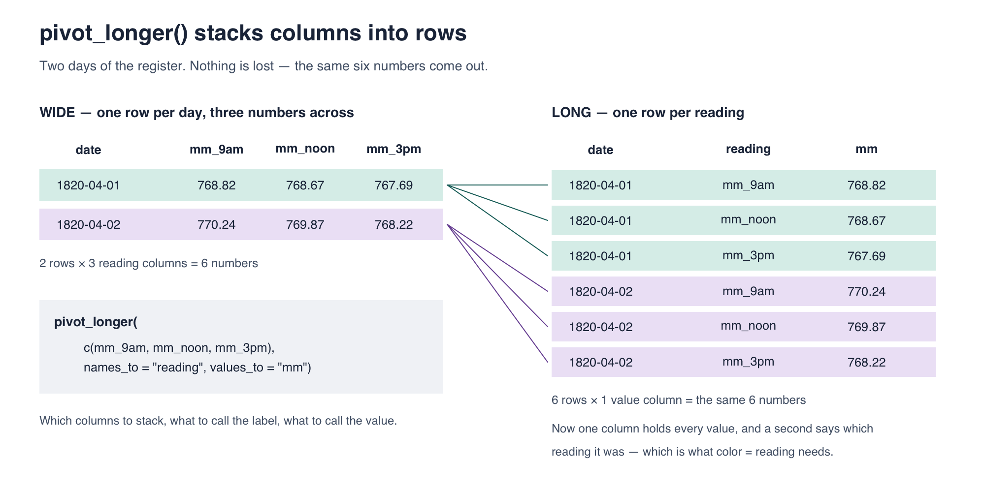
pivot_longer() fixes that by stacking the three columns into one:

april_long <- april |>
  pivot_longer(c(mm_9am, mm_noon, mm_3pm),
               names_to = "reading", values_to = "mm")
head(april_long)

Three arguments: which columns to stack, what to call the column that remembers where each value came from (names_to), and what to call the column holding the values themselves (values_to).

Here is the whole operation on two days, small enough to check by eye:

Two days of the Paris register shown wide, with one row per day and three columns mm_9am, mm_noon and mm_3pm, then the same six numbers shown long, with one row per reading and columns date, reading and mm. Coloured lines join each long row back to the day it came from.

Six numbers go in and six come out. Nothing is summarised and nothing is dropped — it is the same data in a different shape. Wide is usually easier for a person to read; long is what plotting and grouping want.

4.1 How many rows does april have, and how many does april_long? What is the relationship between the two counts? Say what one row means in each table.

NoteWhile you are counting rows

April has 30 days and april has fewer. The register has gaps — days when the reading was not taken, or not published. Nothing in this lab depends on them.

4.2 — Three readings, one month

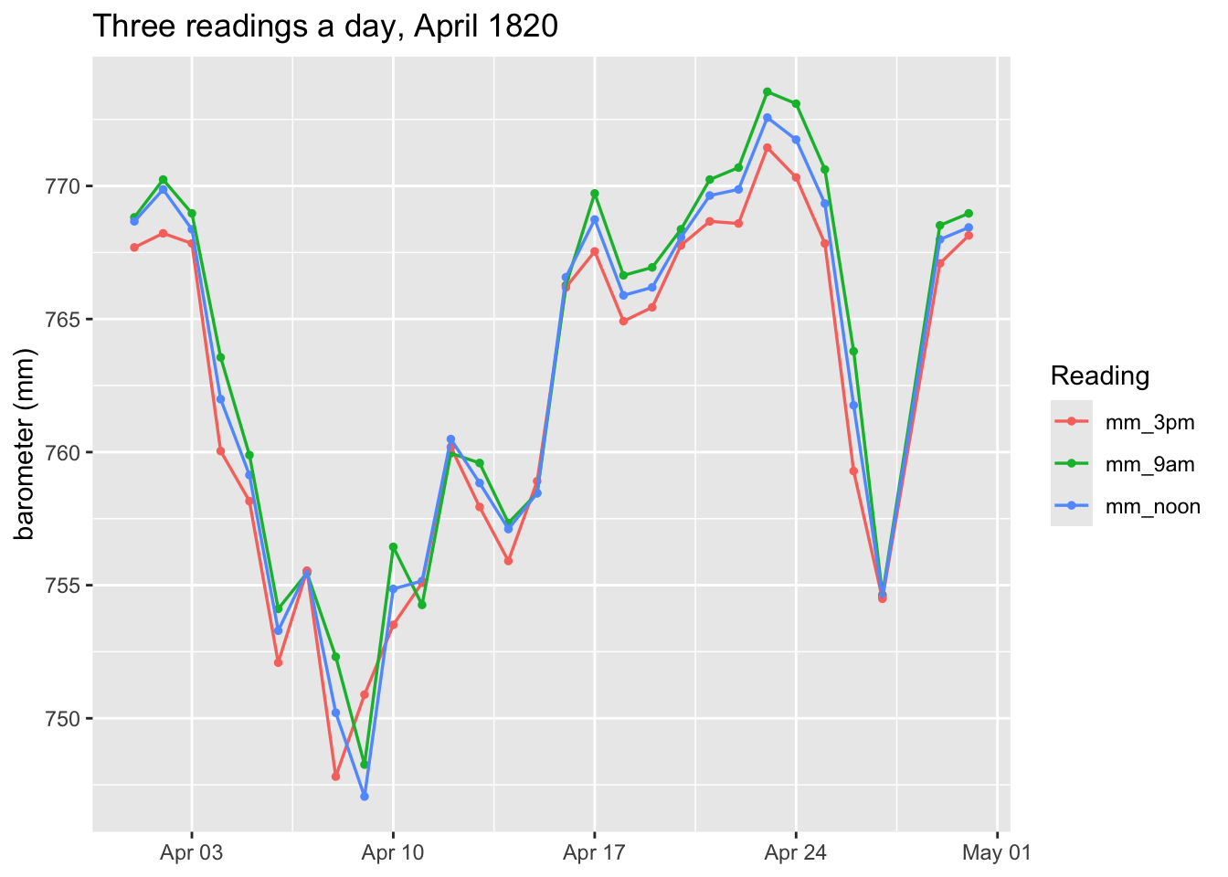
ggplot(april_long, aes(x = date, y = mm, color = reading)) +
  geom_point(size = 1) +
  geom_line(linewidth = 0.6) +
  labs(x = NULL, y = "barometer (mm)", color = "Reading",
       title = "Three readings a day, April 1820")

Now that reading is a column, color = reading can map it, and geom_line() draws one line per value it finds there. ggplot adds the legend by itself. In labs(), we specify what we want the title of this legend to be by specifying color = .... Note that we included geom_point() and geom_line() and both, the points and the lines, got stacked on the plot together.

4.2 Describe what the three lines do. Does knowing the 9 a.m. reading leave you in much doubt about the noon reading?

4.3 — The same thing as a scatterplot

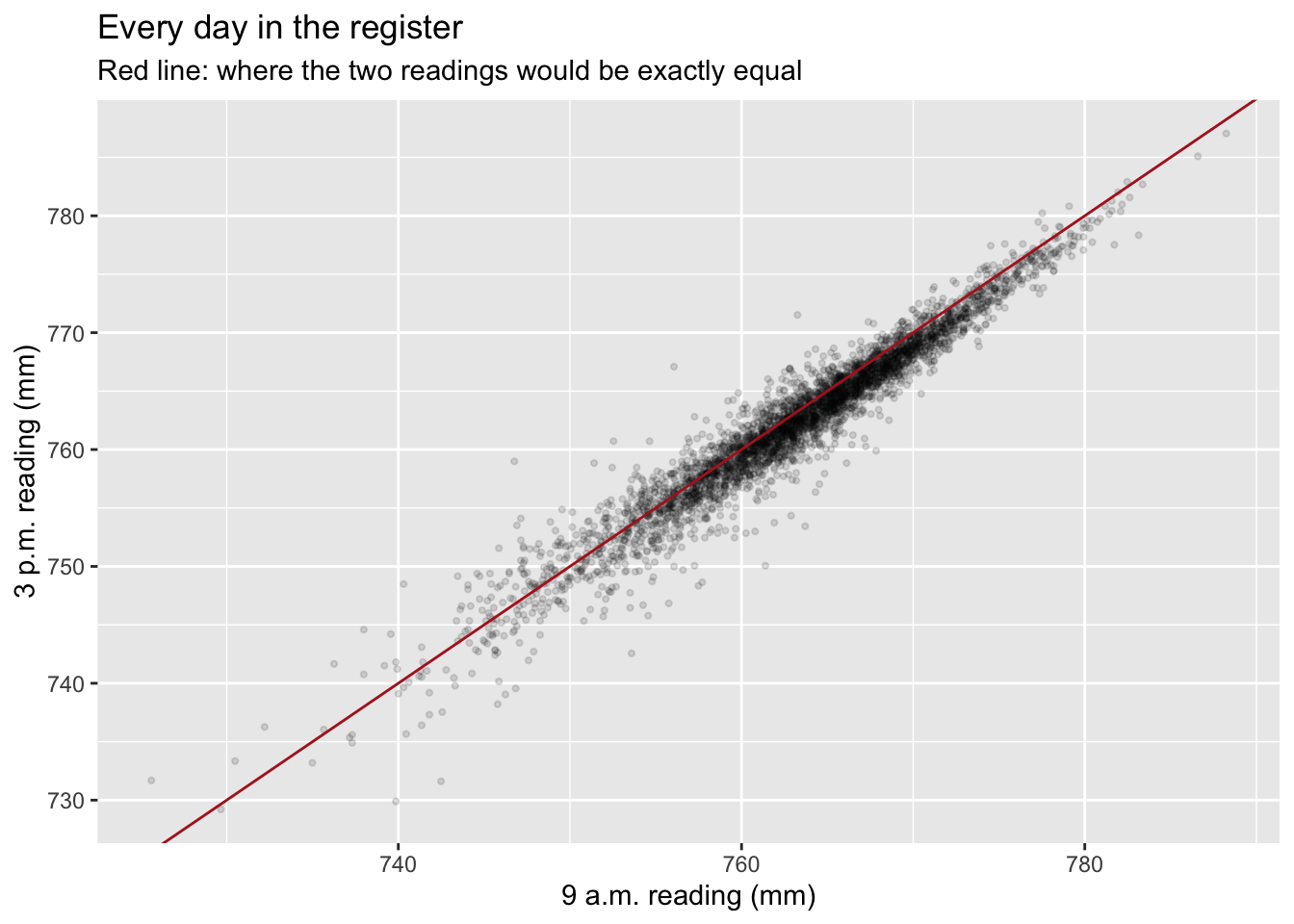
A time plot shows two series moving together. A scatterplot puts one against the other directly.

ggplot(register, aes(x = mm_9am, y = mm_3pm)) +
  geom_point(alpha = 0.12, size = 0.8) +
  geom_abline(slope = 1, intercept = 0, color = "firebrick") +
  labs(x = "9 a.m. reading (mm)", y = "3 p.m. reading (mm)",
       title = "Every day in the register",
       subtitle = "Red line: where the two readings would be exactly equal")

With 3,978 points, alpha = 0.12 makes each one faint so that crowded regions show up dark — the standard fix for a scatterplot with too many points to see through. Let’s look ar correlation coefficients for the tree reading times.

register |>
  select(mm_9am, mm_noon, mm_3pm) |>
  drop_na() |>
  cor() |>
  round(3)
        mm_9am mm_noon mm_3pm
mm_9am   1.000   0.991  0.969
mm_noon  0.991   1.000  0.990
mm_3pm   0.969   0.990  1.000

4.3 How close to the red line do the points sit? Read the three correlations. If the 9 a.m. and 3 p.m. readings have a correlaion of 0.97, how many independent numbers does one day really give you — three, or closer to one?

WarningRender, commit, and push

Render your document, then commit and push before moving on.

4.4 — A third view: the change within a day

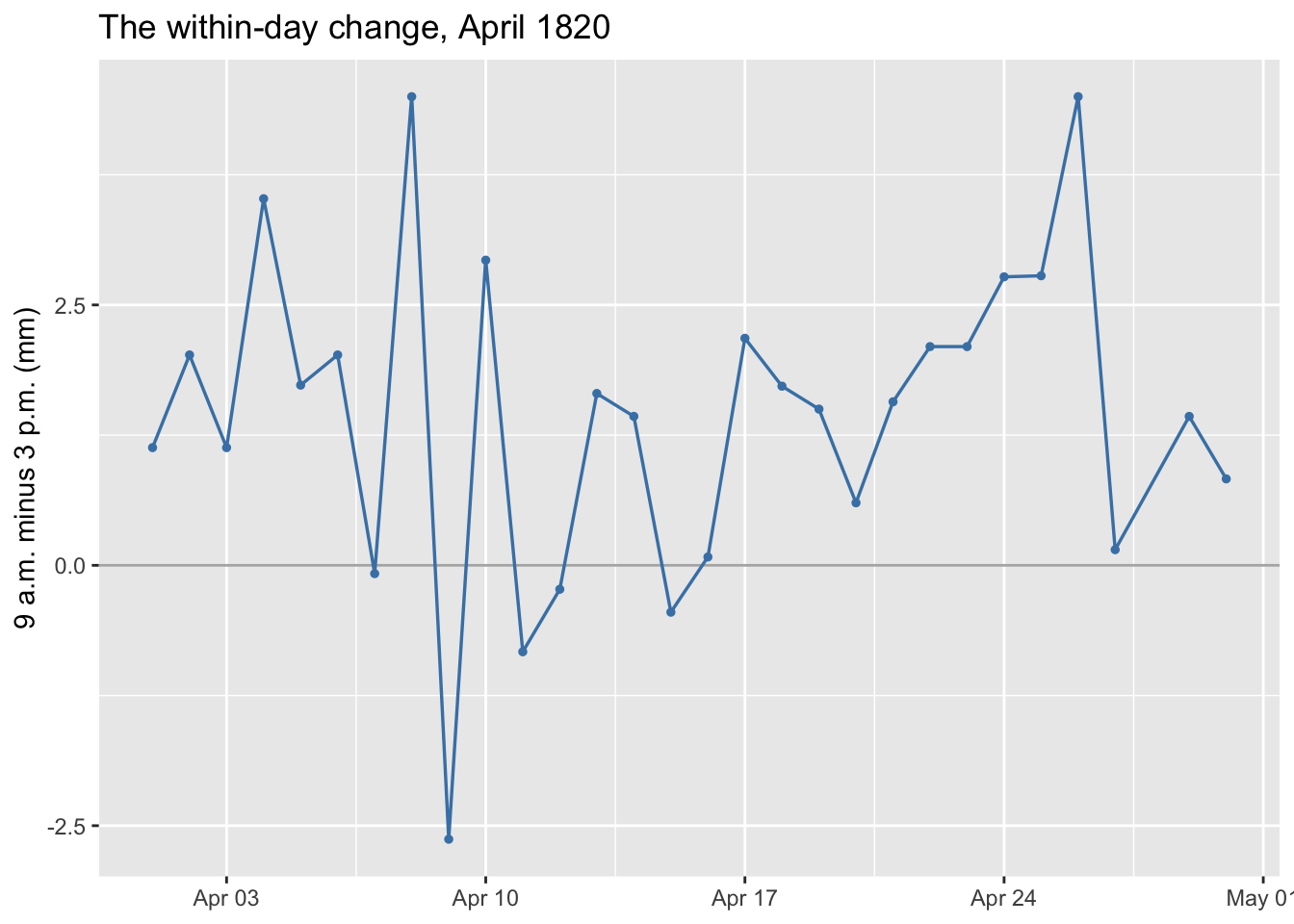
Laplace did not work with the raw readings. He worked with the change within a day — the 9 a.m. reading minus the 3 p.m. one — because whatever the weather was doing affected both readings and mostly cancels out of their difference.

Plot that quantity over the same month:

change_spring <- register |>
  filter(year == 1820, month == 4) |>
  mutate(change = mm_9am - mm_3pm)

ggplot(change_spring, aes(x = date, y = change)) +
  geom_hline(yintercept = 0, color = "grey70") +
  geom_line(color = "steelblue", linewidth = 0.6) +
  geom_point(color = "steelblue", size = 1) +
  labs(x = NULL, y = "9 a.m. minus 3 p.m. (mm)",
       title = "The within-day change, April 1820")

4.4 Compare this picture with the one in 4.2 — same month. The raw readings swung about 25 mm in smooth multi-day waves. What does this one do? If you knew Tuesday’s value, would you have much idea about Wednesday’s?

4.5 — Grouping by month

data/table_4_2.csv holds the within-day change already averaged by month — one value for each month of each year, 1816 to 1826.

monthly <- read_csv("data/table_4_2.csv", show_col_types = FALSE) |>
  mutate(month = factor(month, levels = c("Jan.", "Feb.", "Mar.", "Apr.",
                                          "May", "June", "July", "Aug.",
                                          "Sept.", "Oct.", "Nov.", "Dec.")))
glimpse(monthly)
Rows: 132
Columns: 4
$ month          <fct> Jan., Feb., Mar., Apr., May, June, July, Aug., Sept., O…
$ month_number   <dbl> 1, 2, 3, 4, 5, 6, 7, 8, 9, 10, 11, 12, 1, 2, 3, 4, 5, 6…
$ year           <dbl> 1816, 1816, 1816, 1816, 1816, 1816, 1816, 1816, 1816, 1…
$ mean_change_mm <dbl> 0.513, 0.846, 0.836, 0.894, 0.613, 0.596, 0.537, 0.951,…

132 rows, one per month-of-a-year, in the same long shape you made in 4.1: each row carries its value plus the labels saying which month and which year it belongs to. Printed on a page this would usually be laid out as a grid, twelve months by eleven years — but in a data frame it is a stack of 132 rows, and that is the shape group_by() wants.

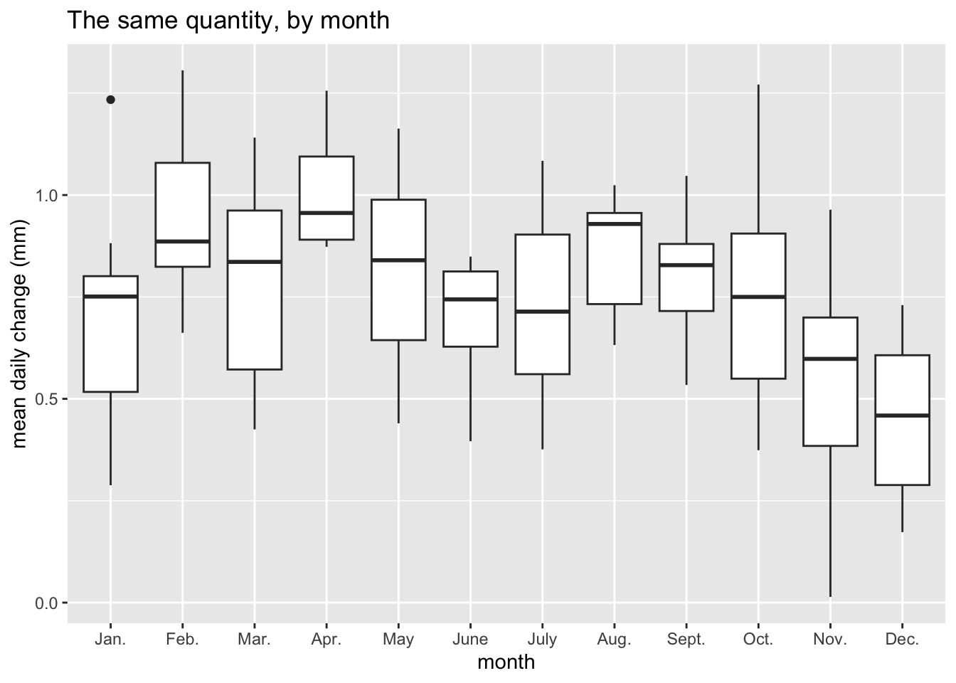
Because the labels are columns, you can group by either of them. A boxplot does exactly that: it splits the rows by a label and draws one box per group. Each box covers the middle half of that group’s values, the thick line is the median, and isolated points sit far from the rest.

ggplot(monthly, aes(x = month, y = mean_change_mm)) +
  geom_boxplot() +
  labs(x = "month", y = "mean daily change (mm)",
       title = "The same quantity, by month")

4.5 Careful what this axis is measuring. It is not how high the barometer stood — it is how much it moved between 9 a.m. and 3 p.m. A low month is one where the barometer barely shifted over the course of a day; a high month is one where it swung further.

Describe what you see. Is there a shape across the year, and which months move most and least?

Then the question that matters: would you say the eleven observations in December come from the same distribution as the eleven in April? Not “are they equal” — the eleven within December are not equal to each other either. The question is whether all twenty-two look like they were generated by one process, or by two different ones.

4.6 — Now do it by year

Same plot, with year in place of month.

# YOUR CODE HERE -- adapt the by-month plot
TipOne thing will go wrong

month arrived as a factor, so ggplot knew to treat it as twelve separate groups. year is stored as a number, and on a numeric axis geom_boxplot() has no idea where one group ends and the next begins — it draws a single box across the whole span and warns you about a “continuous x aesthetic”.

Wrap it: aes(x = factor(year), ...). That tells ggplot the eleven years are eleven labels, not points on a number line.

4.6 Describe what you see here too. Then hold the two pictures side by side: does one of them show a pattern that the other does not?

4.7 — Five pictures of one register

You have now drawn the same data five ways: three readings over time, a scatterplot of 9 a.m. against 3 p.m., the within-day change over time, a boxplot by month, and a boxplot by year.

4.7 For each one, write a single sentence saying what it shows that the others cannot. Some prompts, if you are stuck: which plots would survive if the rows were shuffled into a random order? Which one would you use to argue that one day gives you roughly one number rather than three? Which would you use to argue that February is genuinely different from December?

Part 5 — AI slot: ask it what “best” means

Commit before you start. You did this with Mayer’s method in Lab 01. Predict the failure before you run anything.

Ask an AI tool:

Why is the arithmetic mean the best way to combine several measurements of the same quantity?

5.1 Write your prediction first: what do you expect it to leave out?

5.2 Now read what it produced. Does it say best by what standard? You spent Part 3 establishing that the question has no answer until a rule is named — squared errors give the mean, absolute errors the median, worst error the midrange. Check whether the response:

  • names a criterion at all, rather than asserting the mean is best;
  • mentions that a different criterion gives a different answer;
  • mentions the median as a rival, and says when you might prefer it.

5.3 A response can be fluent, correct in every sentence, and still answer a question that has not been made well posed. Did yours do the underdetermined thing you did in the opening activity — pick an answer without noticing the question was incomplete? Quote the sentence where it either does or does not hedge.

Commit again, so the before-and-after is on the record.

Wrap-up

WarningRender, commit, push, and submit

Render your document and inspect the PDF. Check that you have written all three predictions from the opening activity, recorded the board, attempted each code task, filled in the three-row table in 3.5, answered the closing questions, and kept commits before and after the AI activity. Errors with an explanation still count as attempts. Commit and push the .qmd and PDF, then upload that PDF to Gradescope.

Exit ticket (on paper, with your name):

  1. Muddiest point.
  2. One thing you learned today.
  3. Favorite holiday.

References

The historical account follows Stigler, The History of Statistics, ch. 4, pp. 139–160: “Gauss in 1809” and “Reenter Laplace” for the rules and who preferred which, and “A Relative Maturity: Laplace and the Tides of the Atmosphere” for Part 4, whose data is Stigler’s Table 4.2 (p. 156), sourced there to Bouvard (1827).