1 + 1[1] 2This lab is due today, by the end of class. To be considered on time:
lab-02.qmd committed and pushed to your GitHub repo before the exit ticketJacob Bernoulli spent twenty years on one question and died before he finished answering it.
An urn holds 3000 red balls and 2000 blue — a ratio of 3 to 2. You don’t get to look inside. You draw one ball, write down its color, put it back, and draw again. How many draws before you can be sure of the ratio?
Everyone already believed the answer was “lots.” Bernoulli’s contribution was to prove it and to attach a number — to turn a feeling into arithmetic. He wanted what he called moral certainty: odds of 1000 to 1 that the proportion you observed sits within 1/50 of the truth.
His answer was 25,550 draws. That was more people than lived in Basel. He never published it; his nephew found the manuscript and printed it in 1713, eight years after he died.
Twenty years later Abraham de Moivre asked a different question about the same urn. Not how many draws do I need but what shape do the answers make? In a seven-page pamphlet he circulated privately in 1733, he drew the curve — the first time anyone had.
Today we explore both of these things. We have the balls already “drawn” for you and results saves in a data frame called urn_draws.csv.
By the end of this lab you will be able to…
.qmd, and put your answer in the right one of the two.mean(), table(), plot() and hist().Same as last week, and worth doing carefully anyway. Laptops open, follow along, and stop me the second a step doesn’t do on your screen what it does on mine.
1 · Find the repo. Go to the statistical-history organization on GitHub and click the repo whose name starts with lab-02.
2 · Copy the SSH address. Green Code button, SSH selected. The address starts git@github.com:, not https://.
3 · Make it a project. RStudio: File → New Project → Version Control → Git. Paste the address, click Create Project. You should see lab-02.qmd and a data/ folder in the Files pane.
4 · Put your names in it. Open lab-02.qmd, find the YAML block at the very top between the two --- lines, and fill in subtitle with your group’s card and author with your names.
5 · Render it. The Render button. A PDF appears.
Last week you did three of these four. Here is the whole thing, and it is the same every week for the rest of the semester:
| Step | Button | What it actually does | Skip it and… |
|---|---|---|---|
| Pull | Git pane, blue ↓ | Brings down anything changed on GitHub since you last looked | you overwrite a fix, or get a merge conflict |
| Work | — | You type, run chunks, Render to check | — |
| Commit | Git pane, Commit | Saves a snapshot on your laptop | there’s nothing to push |
| Push | Git pane, green ↑ | Sends your commits up to GitHub | I can’t see it, so it isn’t submitted |
Because it isn’t only yours — I can push to it too. If I find a typo in the template at 10:40, I fix it and push, and your Pull is how you get the fix.
Do it now. Click Pull. It will probably say Already up to date. — that is a successful pull, not a failure.
Committing is not submitting. A commit lives on your laptop. Until you Push, your work exists in exactly one place — the laptop — and nobody else can see it.
A code chunk can carry a label — a short name on its own line at the top of the chunk, after #|:
1 + 1[1] 2That first line is not R. #| (hash-pipe) marks a chunk option — an instruction to Quarto about how to handle this chunk, as opposed to R code to run inside it. R never sees it.
Four things the label buys you.
| Why it matters | |
|---|---|
| Navigation | The outline menu at the bottom-left of the file pane lists every labelled chunk. Unlabelled ones show as (Chunk 14) |
| Error messages | When a render fails, Quarto names the chunk it failed in. Error in chunk load-data is findable. Error in chunk 14 means counting grey boxes |
Two rules.
load-data, not Load Data or load_data_1. Describe the job, not the code: running-proportion beats plot-chunk.Give two chunks the same label and rendering stops with:
Error running filter ...
duplicate label 'load-data'
Nothing is broken and nothing is lost. Rename one of the two and render again.
Labels are one kind of chunk option. Two more you’ll see today, each on its own #| line:
mean(c(1, 2, 3))[1] 2echo: false — run the code, but hide the code in the PDF. Show only the output.eval: false — show the code but don’t run it. Useful for code you want the reader to see and not execute.Your template has error: true set once at the top for the whole document, which is why a chunk that throws an error still renders, and still earns full credit.
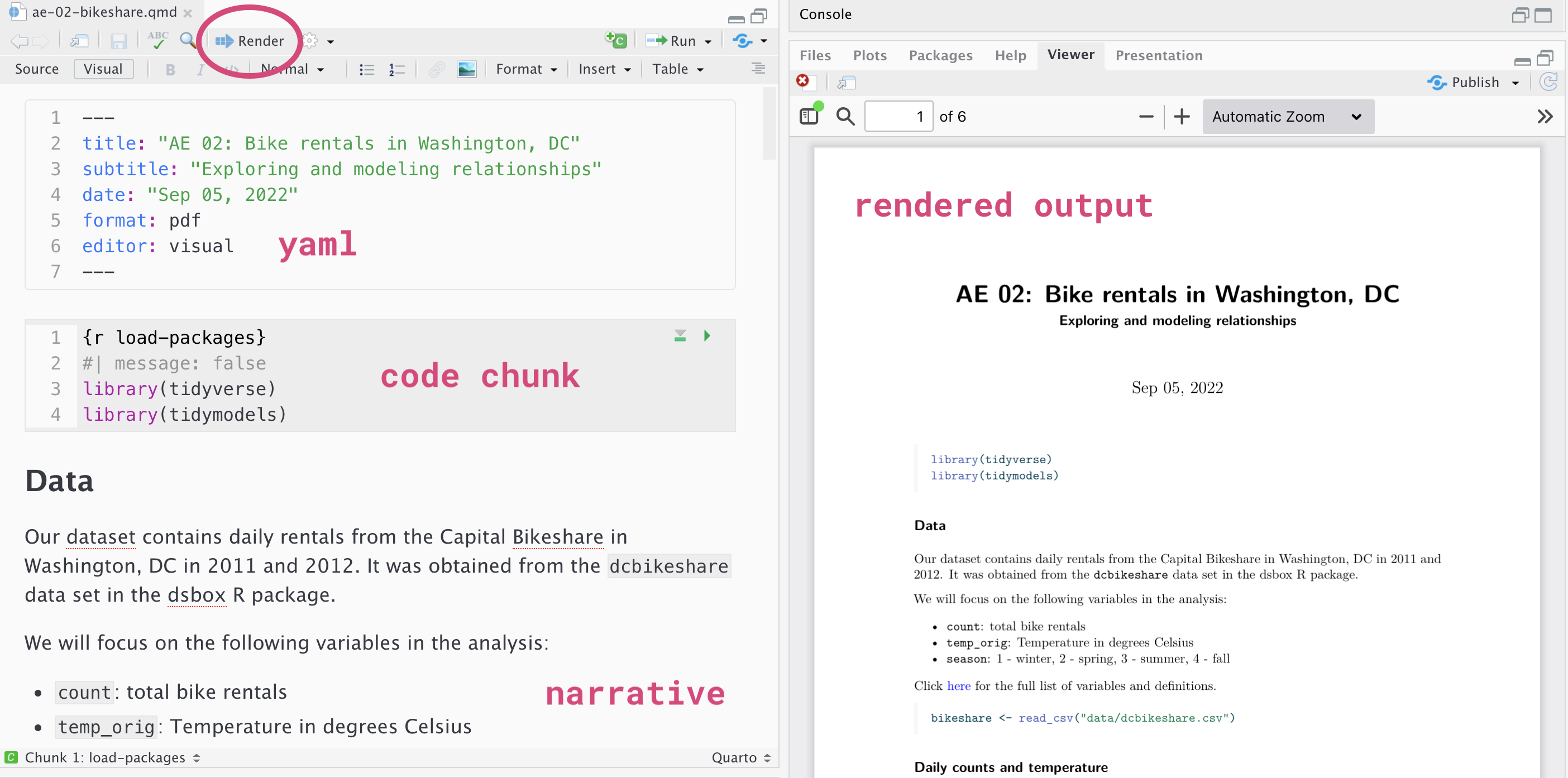
| Part | What it is | Where you type |
|---|---|---|
| YAML | The block at the top between --- lines. Title, author, format |
Only when a step tells you to |
| Text | Ordinary writing. Answers, reasoning, prose | Anywhere outside a chunk |
| Code chunks | The grey blocks that start ```{r} and end ``` |
Only inside the grey |
Text typed inside a chunk is an error. Code typed outside a chunk is just words on a page.
Your template marks every place that needs something from you. There are exactly two shapes, and telling them apart is most of today.
You’ll see a line like this:
Your answer: Replace this line with your answer.
Delete the italic sentence and type yours in its place. Ordinary writing, in the document, outside any chunk. No quotes, no backticks, no #. Full sentences.
> at the start of the line is doing
It makes a block quote — the indented, set-off look. It’s there so your answers are easy to find when you’re page-matching on Gradescope. Keep it at the start of the line; type after it.
You’ll see a grey chunk with a comment in it:
# YOUR CODE HERE — the mean of the columnDelete the comment line and type R in its place, inside the grey. The # makes that line a comment — R reads it and does nothing — so leaving it there won’t cause an error. It just means you didn’t answer.
Two of today’s exercises ask you to create a chunk, not fill one in. Three ways, all fine:
| How | Where |
|---|---|
The +C green button |
Top right of the Source pane |
| Cmd+Opt + I (or Ctrl + Alt + I on Windows) | The keyboard shortcut. Worth learning |
| Type it | ```{r} , a newline, your code, a newline, ``` |
Whichever you use, add a #| label: line yourself. The buttons don’t add one.
Look at the top left of the Source pane. There are two small tabs: Source and Visual. Click Visual.
It is the same file. Not a preview, not a copy — the same lab-02.qmd on disk. You can switch back and forth as often as you like, and everything you type in one shows up in the other.
In Visual, prose behaves the way it does in Word or Google Docs:
| To get | In Source, type | In Visual |
|---|---|---|
| bold | **bold** |
Cmd/Ctrl + B, or the B button |
| italic | *italic* |
Cmd/Ctrl + I, or the I button |
| A heading | ## Exercise 2 |
The Header 2 dropdown |
| A bullet list | - thing |
The bullet button, then just hit Enter |
| A link | [text](url) |
Cmd/Ctrl + K, paste the URL |
Code chunks are still code chunks in Visual mode. They show up as grey boxes with a little green ▶ Run button, your #| label: line is right there, and the code runs exactly the same. Nothing about R changes.
Whichever you want, and you can switch mid-sentence. A reasonable default: Visual for writing prose answers, Source for writing code. Most of this course’s staff live in Source out of habit, and that is a habit, not a rule.
The one thing to know: when you switch from Visual back to Source, Quarto re-wraps your paragraphs — the words are identical but the line breaks may move. That shows up as a big green-and-red block in the Git Diff view, and it is not an error. Your text is fine.
Switch to Visual. Type a sentence in the space provided, and make one word bold with Cmd/Ctrl + B. Then switch back to Source and look at what happened to it.
Your answer: Replace this line with a sentence of your own, with one word bolded.
Then add a code chunk below it (remember to include label), and find the sum of c(9, 11, 2026).
Parts 3, 4 and 5 are yours to work through in your groups, at your own pace.
Goal: get the data in, and turn a column of words into a column of numbers you can do arithmetic on.
urn <- read.csv("data/urn_draws.csv")
dim(urn)
[1] 2000 2head(urn) draw color
1 1 red
2 2 blue
3 3 red
4 4 blue
5 5 blue
6 6 red2000 rows, 2 columns. Each row is one draw from Bernoulli’s urn: reach in, look, write it down, put it back. The urn holds 3000 red balls and 2000 blue, so the true proportion red is \(3000/5000 = 0.6\) — but the drawer doesn’t know that, and neither, for the next half hour, do you.
| Column | What it holds |
|---|---|
draw |
Which draw this was. 1, 2, 3, … 2000 |
color |
"red" or "blue" — text |
First, we exolore the structure of our data.
str(urn)'data.frame': 2000 obs. of 2 variables:
$ draw : int 1 2 3 4 5 6 7 8 9 10 ...
$ color: chr "red" "blue" "red" "blue" ...str() is short for structure — every column, its type, and its first few values. int is a whole number, chr is text, and chr is the problem we’re about to solve.
table(urn$color)
blue  red
 800 1200
table() counts how many of each value there are in a column. 800 blue and 1200 red.
Recall our conversation from lecture about the difference in Head/Tails versus 1’s/0’s. Similar idea applies to red/blue. While it does not make sense to consider quantity \(p^{red}\), we can consider an indicator of the event “the ball is red”. So we begin by constructing such an indicator.
== asks a comparison questionhead(urn$color)[1] "red" "blue" "red" "blue" "blue" "red" head(urn$color) == "red"[1] TRUE FALSE TRUE FALSE FALSE TRUEhead() shows the first few values of whatever you hand it — here, the first six colors.
== means “is this equal to?” It is a question, and the answer comes back as TRUE or FALSE. Six words in, six TRUE/FALSE answers out — one per value, in the same order. R asked the question of every element without being told to loop.
ifelse() turns the answer into numbersurn$red <- ifelse(urn$color == "red", 1, 0)
head(urn) draw color red
1 1 red 1
2 2 blue 0
3 3 red 1
4 4 blue 0
5 5 blue 0
6 6 red 1dim(urn)[1] 2000 3ifelse() takes three arguments, in this order:
| Position | Here | What it is |
|---|---|---|
| test | urn$color == "red" |
The question. One TRUE/FALSE per row |
| yes | 1 |
What to use wherever the answer is TRUE |
| no | 0 |
What to use wherever it’s FALSE |
Read it out loud as a sentence: “for each row, if the color equals red, put a 1, otherwise put a 0 — and store that as a new column called red.”
dim() now says 3 columns. $ on the left of <- creates a column if it wasn’t there before.
mean(urn$red)[1] 0.6Because red holds only 0s and 1s, its average is the proportion of 1s. Adding 1200 ones and 800 zeros gives 1200; dividing by 2000 gives 0.6.
mean() adds everything up and divides by how many. When everything is a 0 or a 1, the sum is just a count of the 1s — so the mean is count of 1s ÷ total = the proportion.
This is why 0/1 columns are everywhere in statistics. You never need a separate “proportion” function; mean() already is one.
urn$red[1:10] [1] 1 0 1 0 0 1 1 0 0 0mean(urn$red[1:10])[1] 0.4[1:10] means “positions 1 through 10.”
Write these in your document before moving on.
urn$red[51:60] and urn$red[101:110]. Write down all three numbers. Would any of the three, on its own, have told you the urn was 0.6?Goal: compute the proportion after every draw, and look at what it does.
Bernoulli’s claim is about what happens as you keep drawing. So we need the proportion red after 1 draw, after 2, after 3, … all the way to 2000. Two thousand numbers, one line of R.
cumsum(c(1, 0, 1, 1, 0))[1] 1 1 2 3 3cumsum() is the cumulative sum — a running total. Read it left to right: after the first value we’re at 1, after the second still 1, then 2, then 3, then 3. So cumsum(urn$red) is how many red balls we have seen so far, at every point in the sequence.
Proportion is reds so far ÷ draws so far. We have reds so far. And draws so far is already in the data — it’s the draw column, which counts 1, 2, 3, …
urn$running <- cumsum(urn$red) / urn$draw
head(urn)
draw color red running
1 1 red 1 1.0000000
2 2 blue 0 0.5000000
3 3 red 1 0.6666667
4 4 blue 0 0.5000000
5 5 blue 0 0.4000000
6 6 red 1 0.5000000Three things happened on that line:
cumsum(urn$red) — 2000 running totals./ urn$draw — divided by 2000 draw numbers, one against one. R lines the two columns up automatically. You do not write a loop.urn$running <- — creates a fourth column and puts the answer in it.plot(urn$draw, urn$running,
type = "l",
xlab = "Number of draws",
ylab = "Proportion red so far",
main = "Bernoulli's urn: the proportion settles")
abline(h = 0.6, lty = 2)
| Argument | What it does |
|---|---|
type = "l" |
Draw a line, not points. Leave it out and you get 2000 dots |
xlab, ylab |
Axis labels. Always. An unlabelled axis is an unfinished plot |
main |
The title |
abline() adds a straight line to a plot that already exists — h = 0.6 means horizontal, at height 0.6. That dashed line is the truth Bernoulli’s drawer cannot see.
running-prop-500 that redraws this using only the first 500 draws — urn$draw[1:500] against urn$running[1:500]. Give it xlab, ylab and a main. What’s different about the picture, and what isn’t?Bernoulli’s urn is lopsided: 3 red to 2 blue. De Moivre worked the symmetric case — a fair coin, equal chances on both sides — because the algebra is hard enough even when the two sides balance. The general case came later, from Laplace.
So Part 5 is 100 tosses of a fair coin.
If the coin really is fair and you toss it 100 times, what are the chances of each possible number of heads?
That is the forward direction — truth → what the data should do. No data required. No simulation. Just arithmetic.
Toss 100 times and the number of heads is a whole number somewhere from 0 to 100. That’s 101 possibilities, and R will list them:
heads <- 0:100
head(heads)
[1] 0 1 2 3 4 5length(heads)[1] 1010:100 is a shortcut for “count from 0 to 100.” You met it as 1:10 in Part 3.
probs <- dbinom(heads, size = 100, prob = 0.5)dbinom() is base R, and it takes three arguments: \(n\) (size), \(x\) (number of successes) and \(p\) (probability of success) and returns \(P(X=x) = {n \choose x} p^x (1-p)^{n-x}\). In R, you can pass multiple values of \(x\) at once, so here, we pass all 101 possible options for when \(n=100\):
| Argument | Here | Means |
|---|---|---|
| x | heads |
Which outcome — and we handed it all 101 at once |
| size | 100 |
How many tosses |
| prob | 0.5 |
The chance of heads on any one toss |
One probability comes back per outcome, in the same order — the same one-answer-per-value behavior you saw from == in Part 3.
pmf <- data.frame(heads, probs)
head(pmf)
heads probs
1 0 7.888609e-31
2 1 7.888609e-29
3 2 3.904861e-27
4 3 1.275588e-25
5 4 3.093301e-24
6 5 5.939138e-23data.frame() glues vectors together into columns, side by side. This is the same kind of object read.csv() handed you in Part 3 — except you built this one yourself instead of loading it.
sum(pmf$probs)[1] 1The probabilities sum to 1 — has to happen.
plot(pmf$heads, pmf$probs,
     type = "h",
     xlab = "Heads out of 100",
     ylab = "Probability",
     main = "A fair coin, 100 tosses: every outcome and its chance")
type = "h" draws a vertical spike at each point — the right picture for “here is one probability per whole number.”
Every height on that plot was computed from the numbers \(n,x\), and \(p\).
All 101 outcomes are possible — you could get 12 heads out of 100 — but essentially all of the probability is packed between about 35 and 65. And the shape is De Moivre’s problem. Those heights come from binomial coefficients, which are brutal to compute by hand at \(n = 100\). His 1733 pamphlet — “Approximation to the Sum of the Terms of the Binomial expanded into a Series” — found a smooth curve that gets close to them. He was approximating this plot.
You can already see the pile is centred on 50 and most of it sits roughly between 40 and 60. How do you say “roughly” with a number?
For \(n\) tosses with probability \(p\) of heads, there are two formulas you need today, mean and standard deviation:
\[\mu = n \times p \qquad\qquad \sigma = \sqrt{\,n \times p \times (1-p)\,}\]
n <- 100
p <- 0.5
mu    <- n * p
sigma <- sqrt(n * p * (1 - p))
mu
[1] 50sigma[1] 5The mean \(\mu\) is 50 — the count you’d get if the coin behaved perfectly. The standard deviation \(\sigma\) is exactly 5.s
De Moivre’s third contribution — the one people forget — was noticing that this particular number is the natural unit for measuring distance from the center.
We want the probability of landing within \(k\) standard deviations of the mean — that is, anywhere between \(\mu - k\sigma\) and \(\mu + k\sigma\). Because the outcomes are whole numbers, that means adding up the spikes that fall inside the band:
\[P\big(\mu - k\sigma \le X \le \mu + k\sigma\big) \;=\; \sum_{\substack{x \,=\, 0,\,1,\,\ldots,\,100 \\ |x - \mu| \,\le\, k\sigma}} P(X = x)\]
That looks worse than it is. Read it as three instructions, and each one is a piece of R you already have:
| The maths | The R | What it does |
|---|---|---|
| \(\lvert x - \mu\rvert \le k\sigma\) | abs(pmf$heads - mu) <= k * sigma |
a TRUE/FALSE per outcome — is it inside the band? |
| \(\sum\) over those \(x\) | pmf$probs[ ... ] |
keep only the probabilities where that was TRUE |
| \(P(X = x)\) | pmf$probs |
the height of each spike |
Put together, the whole formula is one line:
sum(pmf$probs[abs(pmf$heads - mu) <= 1 * sigma])[1] 0.728747abs() is absolute value — distance from the mean, ignoring which side of it you are on.
Do question 1 before you run anything else.
Guess first. Look at your plot. Between what two numbers of heads do you think 95% of the probability sits? Write down two numbers. Don’t compute — guess, and commit to it in your document.
Now measure. Run the formula above for \(k = 1\), \(k = 2\) and \(k = 3\):
```{r}
sum(pmf$probs[abs(pmf$heads - mu) <= 1 * sigma])
sum(pmf$probs[abs(pmf$heads - mu) <= 2 * sigma])
sum(pmf$probs[abs(pmf$heads - mu) <= 3 * sigma])
```
Write the three numbers down as percentages. Also write down which whole numbers of heads are inside each band — \(\sigma\) is exactly 5, so you can work these out in your head.
Make a new chunk labelled shade-2sd that redraws the plot with the within-2-sd spikes in black and everything else in grey:
```{r}
inside <- abs(pmf$heads - mu) <= 2 * sigma
plot(pmf$heads, pmf$probs, type = "h",
     col = ifelse(inside, "black", "gray80"),
     xlab = "Heads out of 100", ylab = "Probability",
     main = "Within 2 standard deviations of 50")
```
Change the 2 to a 1 and to a 3 and watch the black region grow.
Settle your guess. Compare the two numbers you wrote in question 1 against your 2-sd answer. Were you close? And now the point of the whole exercise: “two standard deviations” and “about 95%” turned out to mean the same thing. Would that still be true for a coin tossed 400 times — or for Bernoulli’s 3-to-2 urn? Say what you think and why.
Back together as a room. Nothing new to run; this is where the three parts turn into one argument.
Your answer: Part 4 plotted a proportion that wandered and settled. Part 5 plotted probabilities that were computed and never moved. One is a sample; the other is the distribution a sample comes from. Which is which — and which of the two could a real experimenter, who doesn’t know the truth, actually have made?
Your answer: Bernoulli wanted 25,550 draws to be morally certain — 1000-to-1 odds of being within 1/50. Our data has 2000. Look at your Part 4 plot at draw 2000. Should he have accepted 2000 draws as enough, given what he was trying to claim? Argue it either way, but pick one.
We set the truth, then looked at what the data did. Truth → data.
A real experimenter is facing the other way. You toss a coin 100 times and get 55 heads. You have exactly one number, and what you want to know is whether the coin is fair. Data → truth.
Look at your Part 5 plot once more and you can see why that is harder. 55 heads sits comfortably inside the fair-coin picture — nothing about it is surprising. But 55 is also exactly the most likely result for a coin that comes up heads 55% of the time, and it sits comfortably inside the picture for 52%, or 58%, too. The forward picture does not invert cleanly. Many different truths could have produced your one number, and the number alone does not choose between them.
Your answer: You have the exact probabilities for a fair coin in front of you. Someone tosses a coin 100 times, gets 55 heads, and asks you whether it is fair. What can you honestly say, and what can’t you?
The vague prompt. Here is a prompt of the kind people actually type:
Plot the binomial distribution.
Your job: rewrite it so that a model with no access to your screen could produce your Part 5 plot — the real one, the one already in your document.
Then write down every single thing you had to pin down that the vague version left open. There are more than you think: what language, how many tosses, what probability of heads, counts or proportions on the x axis, spikes or bars or points, what the axes say, what the title says, whether it should compute the probabilities or simulate them, and what the output should be for.
Commit and push again
Make sure your name is on it as this is how attendance is taken.
None of these is graded, and you are not behind if you never reach them. The first is the best use of the time. 1. Simulate it, and compare. rbinom(1000, 100, 0.5) gives 1000 imaginary people, each tossing 100 times. hist() that, and put it next to your Part 5 plot. They should look alike — one is a sample, the other is the truth it is a sample of. Run the rbinom line twice. Does the exact plot change? Does the histogram? 2. What would have changed your mind? Everything today assumed we know the answer is 0.6. Suppose you didn’t. Looking only at your Part 4 plot, at what number of draws would you have been willing to publish a figure — and what would you have published? 3. Break it on purpose. Give two chunks the same label and render. Read the error message properly. Then fix it. Knowing what a broken render looks like is worth ten minutes of not being stuck later.